The UN Says Maps Shape Perception. Canada Has a View From Up Here.
The UN wants fairer world maps. Nasty Canuck has a simpler question: what happens when Canada stops living along the top edge and puts itself in the middle for once?
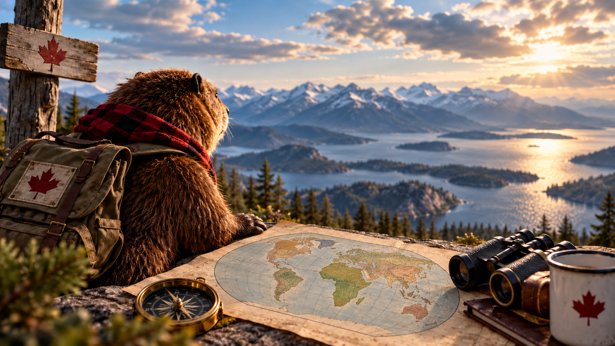
A UN vote aimed at stopping maps from making Africa look smaller raises a bigger question: if every flat map is a choice, what happens when Canada stops living along the top edge and puts itself in the middle for once?
The world has not changed shape. Africa did not suddenly get bigger, Greenland did not shrink, and Canada has not drifted south for the winter.
But earlier this month, the United Nations General Assembly voted overwhelmingly in favour of a non-binding resolution asking governments, schools, international organizations and technology actors to think more carefully about how they draw the world. Led by Togo on behalf of the African Group, the resolution passed by 164 votes to one, with six abstentions.
The issue is not that familiar world maps are fake. It is that every flat map makes choices, and some of those choices have consequences. The Mercator projection, for example, is useful for navigation because it preserves local angles and makes constant compass bearings easy to plot. But when it is used as a general picture of the planet, it greatly exaggerates areas near the poles. Africa can end up looking much smaller relative to Europe, North America and Greenland than it actually is.
That matters because maps do more than tell us where things are. They also shape our sense of scale, distance and importance.
The UN resolution does not ban Mercator, impose a single official world map or redraw international borders. Instead, it encourages wider use and understanding of projections that represent the relative size of continents more accurately, including equal-area approaches. The point is not to declare one map perfect. There is no perfect flat map.
The Earth is a globe. Paper and screens generally are not. Flatten one onto the other and something has to give: shape, area, distance, direction, or some combination of them. As the U.S. Geological Survey explains, every flat map misrepresents the Earth's surface in some way. Different projections are useful for different jobs.
Canada has spent a long time at the top of somebody else's map
Look at a conventional classroom world map and Canada often appears stretched across the upper edge like decorative trim on somebody else's planet.
Quite large. Very polite. Please continue looking at everything happening below us.
That familiar view can hide something important about Canada's geography. Canada is an Atlantic country, a Pacific country and an Arctic country. It sits beside the United States, reaches toward Europe across one ocean and Asia across another, and occupies an enormous northern space that looks very different when the globe is viewed from above rather than straight across.
Change the centre of the map and none of those facts change. What changes is what your eye notices first.
Even equal-area maps can be centred on different meridians, and cartographers routinely change orientation depending on what they want a map to show. The Equal Earth project publishes versions centred on different parts of the globe, including maps with south at the top.
So Nasty Canuck would like to make a modest cartographic proposal of its own.
Canada at the Centre
Take the same planet. Keep every country exactly where it is. Do not enlarge Canada by a single square kilometre.
Just centre the view on us. Not because Canada is the centre of the world. Because every map has to put something somewhere.
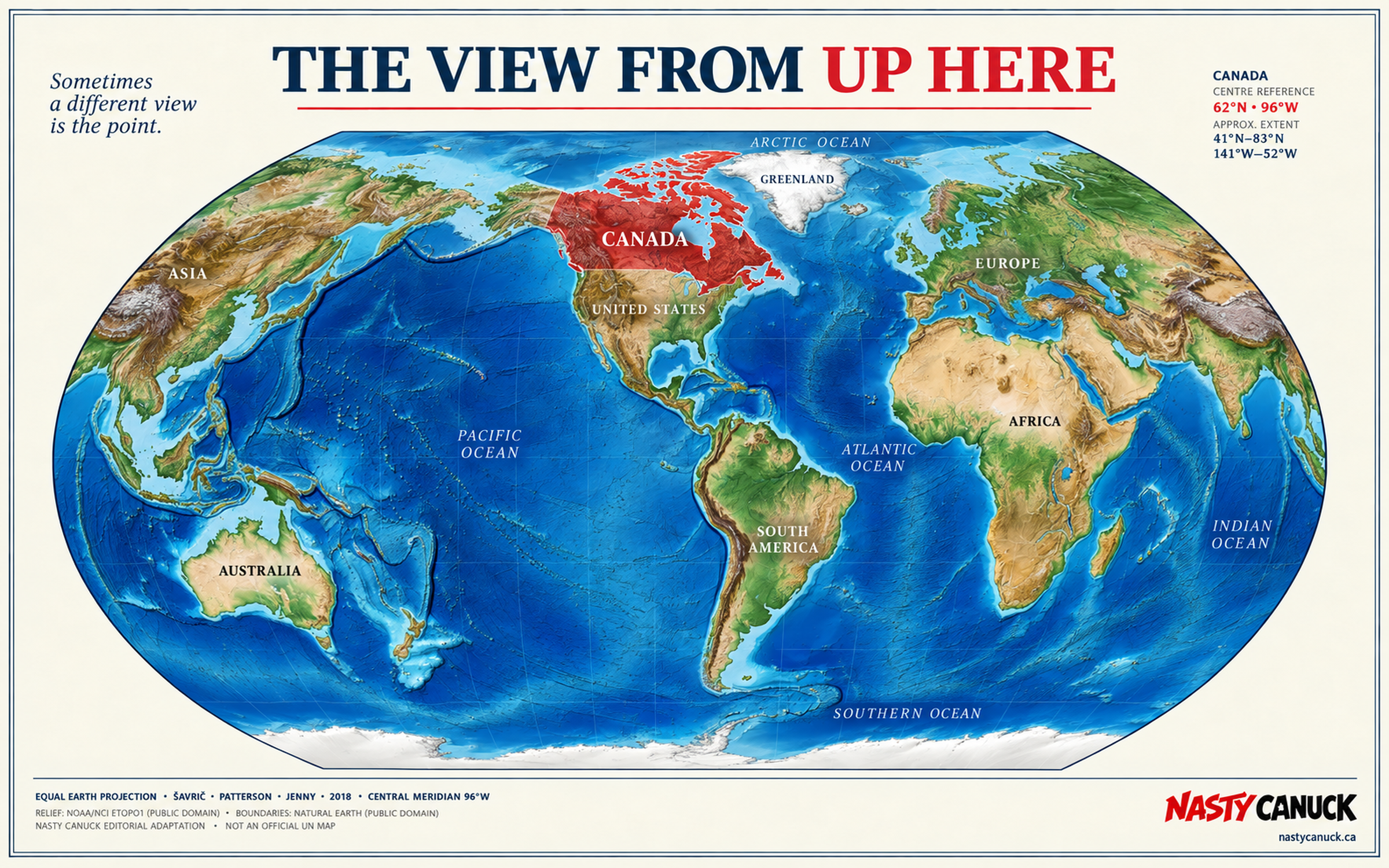
Download the map: Printable PDF (17×11) · Desktop wallpaper (3840×2400)
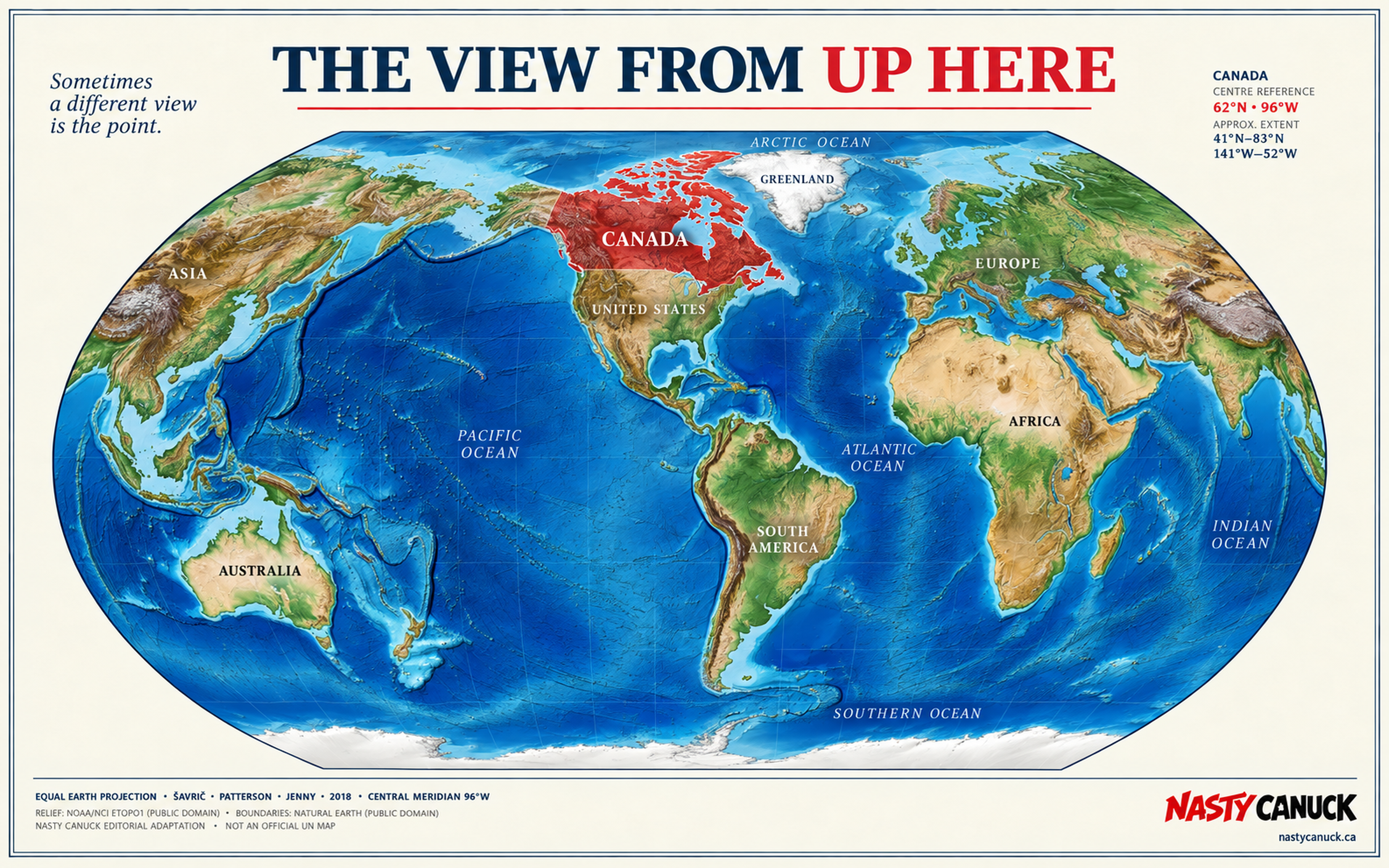
Suddenly Canada stops looking like something stapled across the top of North America. The Arctic becomes less like empty white space at the end of the map and more like part of the geography connecting North America, Europe and Asia. The Atlantic and Pacific stop looking like opposite edges and start looking more like Canada's two enormous front doors.
The United States remains exactly where we left it, which is reassuring.
Nothing has moved. We have simply changed where we are standing.
That is really the interesting part of the UN debate. A map can be useful for one purpose and misleading for another. It can privilege navigation over area, familiarity over proportion, or convention over perspective. The projection does not merely determine how a map looks. It influences what becomes visually obvious.
For African countries, that has real consequences. Supporters of the UN resolution argue that generations of people have grown up seeing a continent depicted at a misleading scale relative to other parts of the world. In presenting the resolution, Togo's representative argued that maps influence education, imagination and collective perception.
That deserves to be taken seriously. Nasty Canuck just does not believe taking an idea seriously requires taking ourselves quite as seriously.
Same planet. Different centre.
The UN debate started with a serious point: maps shape perception. Our little Canadian experiment does not change the planet or make Canada more important. It simply changes the frame — and with it, what becomes obvious.
The Arctic looks less like the blank top edge of somebody else's map. The Atlantic and Pacific look more like gateways. Canada looks less like a country hanging off the top of North America and more like a country facing three oceans and several directions at once.
That is probably enough cartographic mischief for one article.
But once you start changing the lens, it becomes difficult to stop. We may have a few less conventional maps in mind.
For now: same planet. Different centre.